….day four of my personal drawing challenge

….day four of my personal drawing challenge
…and another flower
Three years ago my daughter bought me a book of 500 art prompts. The first couple of weeks I was pretty good at sketching the prompts but for some reason I was hung up on the next prompt in the book and put it aside. For some reason I have a need to do the prompts in order and not skip any. I should have kept the book in plain sight but I put it back into my book shelf and forgot about it. Today I did the next two prompts and will keep the book next to my pens.


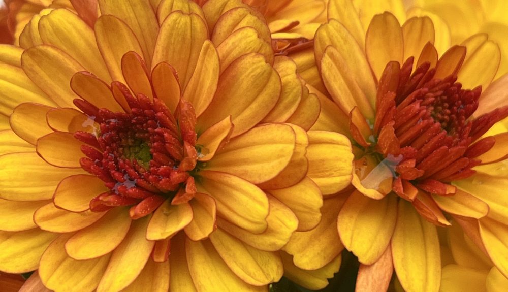
….on day one I’ve started to draw from my new book In Bloom by Rachel Reinert
I’ve tried this before where I wanted to make art every day of the year. I made a lot but I didn’t quite hit 365 drawings in 2018. This year I won’t beat myself up if I miss a day or two but I’m going to give it another go. My husband gave me a book for Christmas that I asked for and today I cracked it open and drew the first two flowers featured in the book.
I’ve discovered over the years that I’m very much drawn to flowers in my photography and my art. I always believe there’s more to learn so I’m really looking forward to drawing and learning more about flowers.


…..thanks to Fandango for the One Word Challenge
The lowly pencil is often overlooked as a writing and/or art tool. On my recent trip to London I noticed numerous artists sketching the marble statues in the V&A gallery so I decided to try my hand at it. I frequently sketch directly with ink, pen or marker but I decided to use pencil instead.
When I first posted my sketch on the family What’s App page my son who is a curator at the museum immediately told me that I had the statue’s foot pointing in the wrong direction. I’m glad that I took a photo of the actual statue because when I went back to check, sure enough I had drawn the foot facing inward instead of outward. Not sure if it was the angle at which I was sitting but I was grateful that I used pencil. Out came the eraser and I fixed it as best I could.

….more difficult than I thought
I’ve done two more painting of the cliffs at Howth and I’m trying to be less rigid and looser in my approach with shapes and lines. I’m not there yet but each painting is slightly different from the first one that I attempted a couple of days ago. I’ll keep trying.


….trying to be less rigid on days 174 and 175
The second assignment with Anita Lehmann was to do a series of landscapes using the same elements we used for our pears. Anita is trying to get us to pull out shapes to create an abstract painting. I chose a photo that I took when I was in Ireland. We took a hike along the cliffs of Howth and I took this photo overlooking the Irish Channel.

Here are my studies:

The following piece was my first motive painting. I realized as I was painting that I was being too finicky and that I needed to be more relaxed and loose. Some of the comments that I received were ‘You have made some great marks – i would try and go more abstract if that’s the direction you want to take in this class. Just a suggestion of rock, grass and sea..’ and ‘Your many studies become wonderful investigation of the next steps in a landscape and perhaps the mood or mark that becomes true to the concepts you wish to convey.
I don’t think I’m quite there yet. I’ve done two more of the same scene that I will share with you tomorrow.
….Days 172 and 173
In Anita Lehmanns’s class, Translating Landscapes, we had to take an object and draw and paint it eight different ways using different elements of design. We had to create a play field and create pleasing shapes while investigating the design elements shape, edges, line, texture, value, space and colour. For our eighth painting we could choose our favourite elements.
….day 171 of 365 Days of Art
Recently I showed you 6 prints that I made in a print making class using found objects to give the print texture. Some of the prints were ghost prints which means that a second piece of paper was put over the inked design and when it went through the press a lighter version of the first print appears.
Here is the ghost print of one of my designs.

I decided to brighten this print with some light blue watercolour to the rope at the top and on the bird where I also added a few details, like an eye. Some lines were incorporated to blend the body into the tail feathers and create a wing. I also added some gold geli pen on the grasses and around the beak. After darkening the border slightly I also added some gold detail on the bottom right corner and a little more in the upper left hand corner to balance it.
You may have noticed that I haven’t signed it yet. Your input would be greatly appreciated.
….Days 169 and 170
I’m taking a new course through Carla Sonheim called Translating Landscapes. Our instructor is Anita Lehmann and her first lesson is all about mark making, experimenting with different tools and mediums (ink, pastels, charcoal, pencil) and responding to music. She encourages us to be messy, free and loose. It’s a lot of fun.
Here are my studies of lines using a variety of tools and inks and charcoals.
When I turned on the music I also used pressed pastels and walnut ink along with the black ink, charcoal and pencil.


….days 166, 167, 168
Last week I took a print making class where we used found objects to create interesting textures and designs. We used oil based inks that can be cleaned with water and when we were ready to print we put our pieces through a large press. It was a fun evening and made me want to own my own press.
I made two copies of each print. The second press is called a ghost print because the colours are much lighter than the original print. Since taking the following photos I’ve added more detail to some of these which I will share with you when I’m done.


