…thanks to Cee for hosting the The Fun Foto Challenge
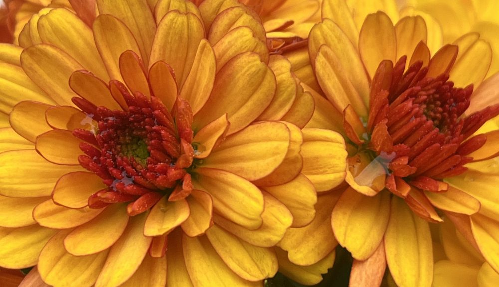
Orange and Pink? Together? Now that’s a challenge.


…thanks to Cee for hosting the The Fun Foto Challenge
Orange and Pink? Together? Now that’s a challenge.
….thanks to Snow for hosting this week’s Friendly Friday
I guess ‘coral-ish’ is any colour in the orange family.


….thanks to Nancy Merrill for hosting A Photo a Week Challenge
Contrasting colours or complementary colours are opposite each other on the colour wheel. They are often used in costumes and uniforms because together the colours really stand out. The following are examples of complementary colours: purple and yellow, red and green and orange and blue.


….thanks to Cee for creating the theme a Floral Fireworks


….thanks to Cee for hosting the Fun Foto Challenge


….thanks to Second Wind Leisure for hosting Sunday Stills


….thanks to Becky B for hosting September Squares


….thanks to Cee for hosting the Fun Foto Challenge


….thanks to Cee for hosting the Fun Foto Challenge
This week the words that I have to work with are Purple, colors, wood, garage, vintage car, flames
Vintage Cars


Flames


Purple


 Mama Cormier