Scratch Art

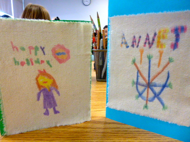
….brown craft paper, oil pastels, and black acrylic paint

Last week I discovered that I was running out of some basic materials, like glue sticks and my supply order that I made weeks before the holidays still hadn’t arrived. After rummaging through the supply cupboard I found enough brown paper for two classes. I had plenty of oil pastels and 2 jars of black acrylic paint.

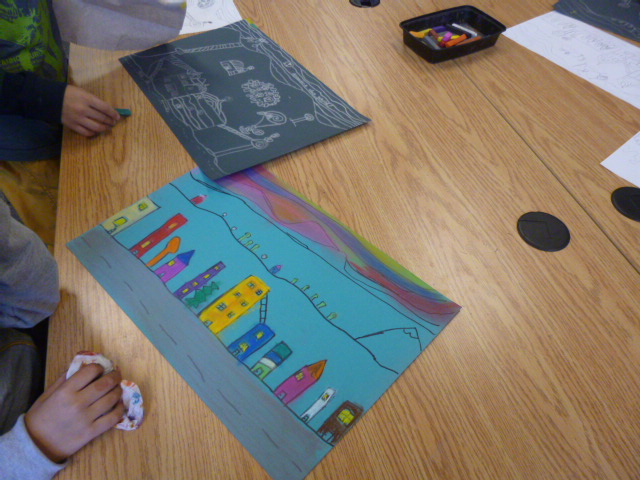
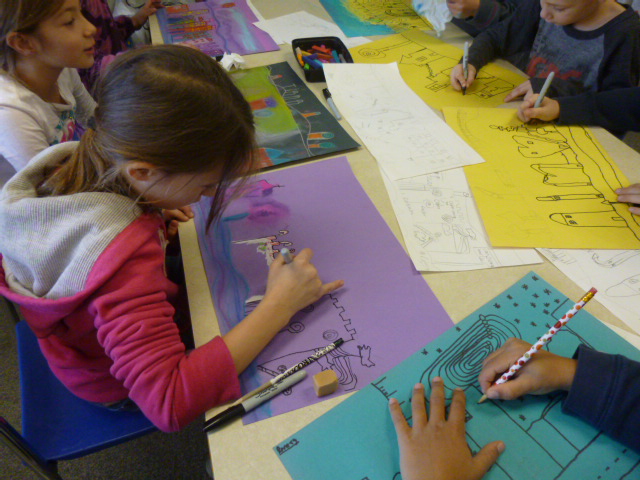
Some of the students were still finishing their Hundertwasser style landscapes using chalk pastel, so it was interesting for them to experience a new medium, oil pastels. Everyone was busy, either finishing projects or starting a new one. I set up one table for painting to limit the mess and thank goodness for my new drying rack.

Scratch Art from Scratch

I’ve never attempted to do scratch art projects because I’ve only ever seen them done using pre-made scratch boards. As I was going through one of my many art book for children I discovered a simple way to make our own black scratch papers. I have to say that making our own papers was very satisfying and gave the children some experience using oil pastels. I loved using the brown paper and the students were encouraged to leave some of the brown edges exposed.

IMG_0203 IMG_0204 IMG_0205

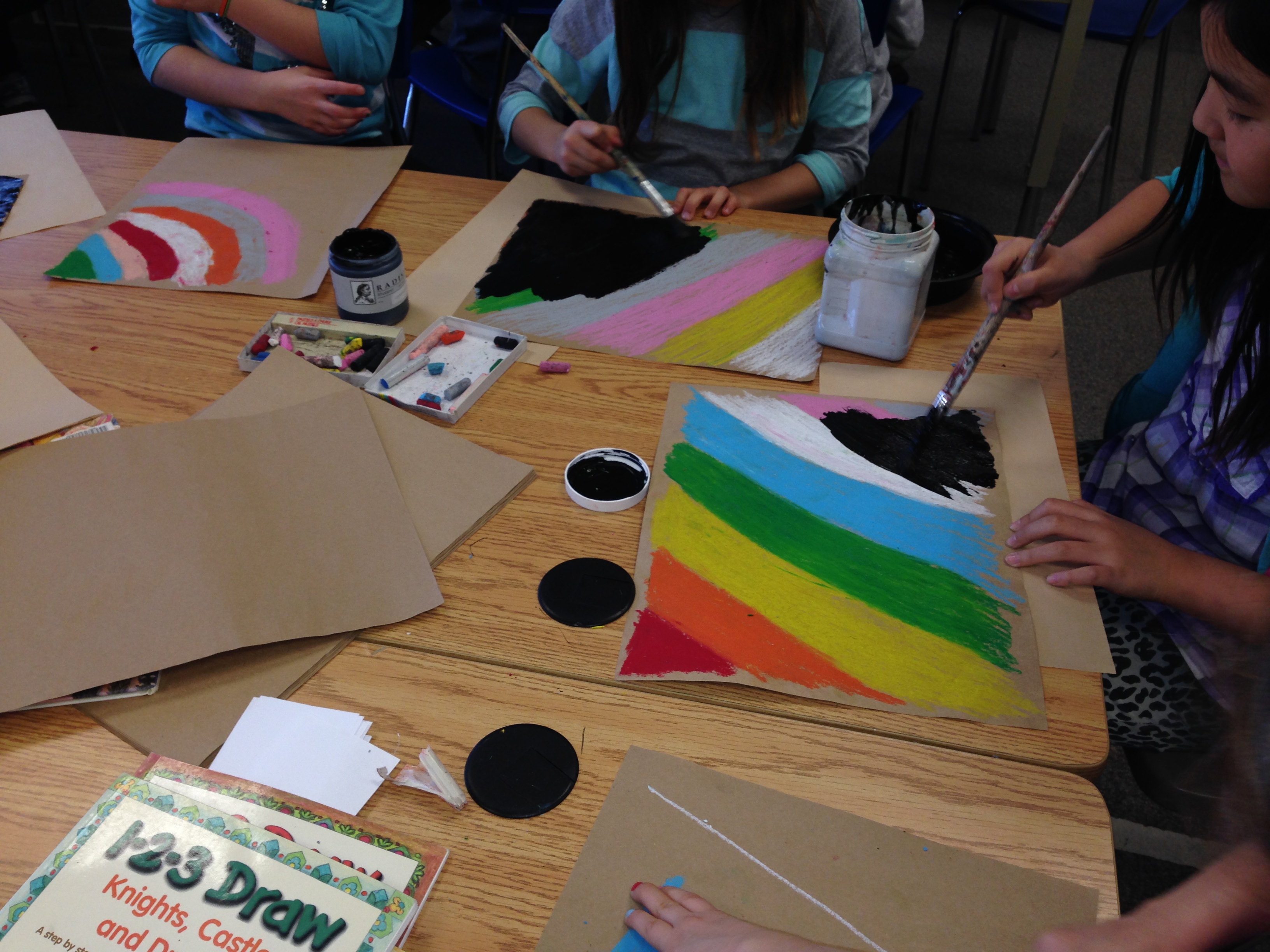
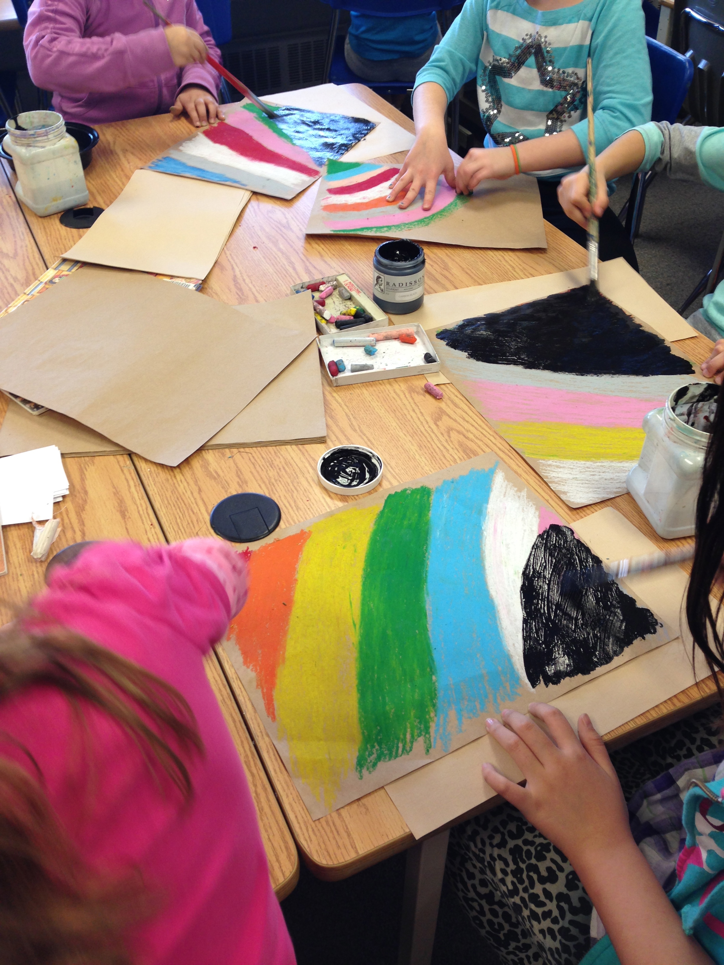
Students are encouraged to lay down a thick layer of pastels. No background paper should show through. Once we were satisfied with the amount of pastel on the paper we painted a thick layer of black acrylic paint. Before you do this make sure that each student has written their name on the back of their paper or you will have quite a time trying to determine who belongs to the blackened sheets when they come back a week later.

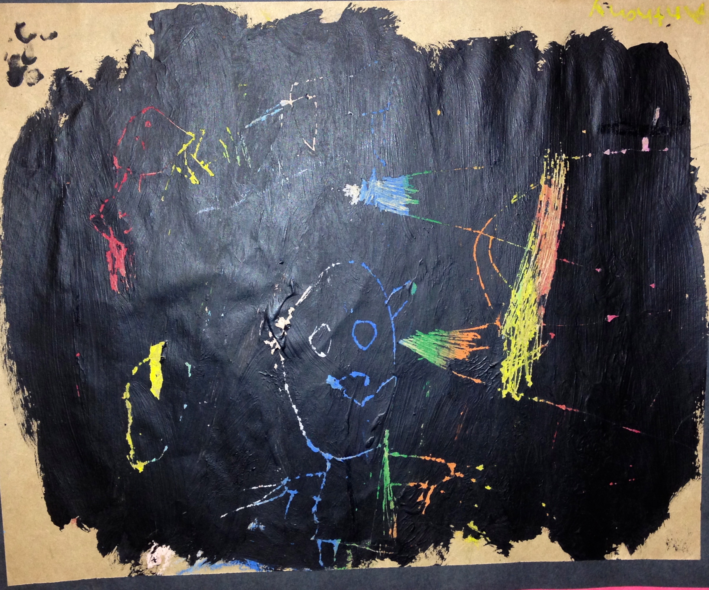
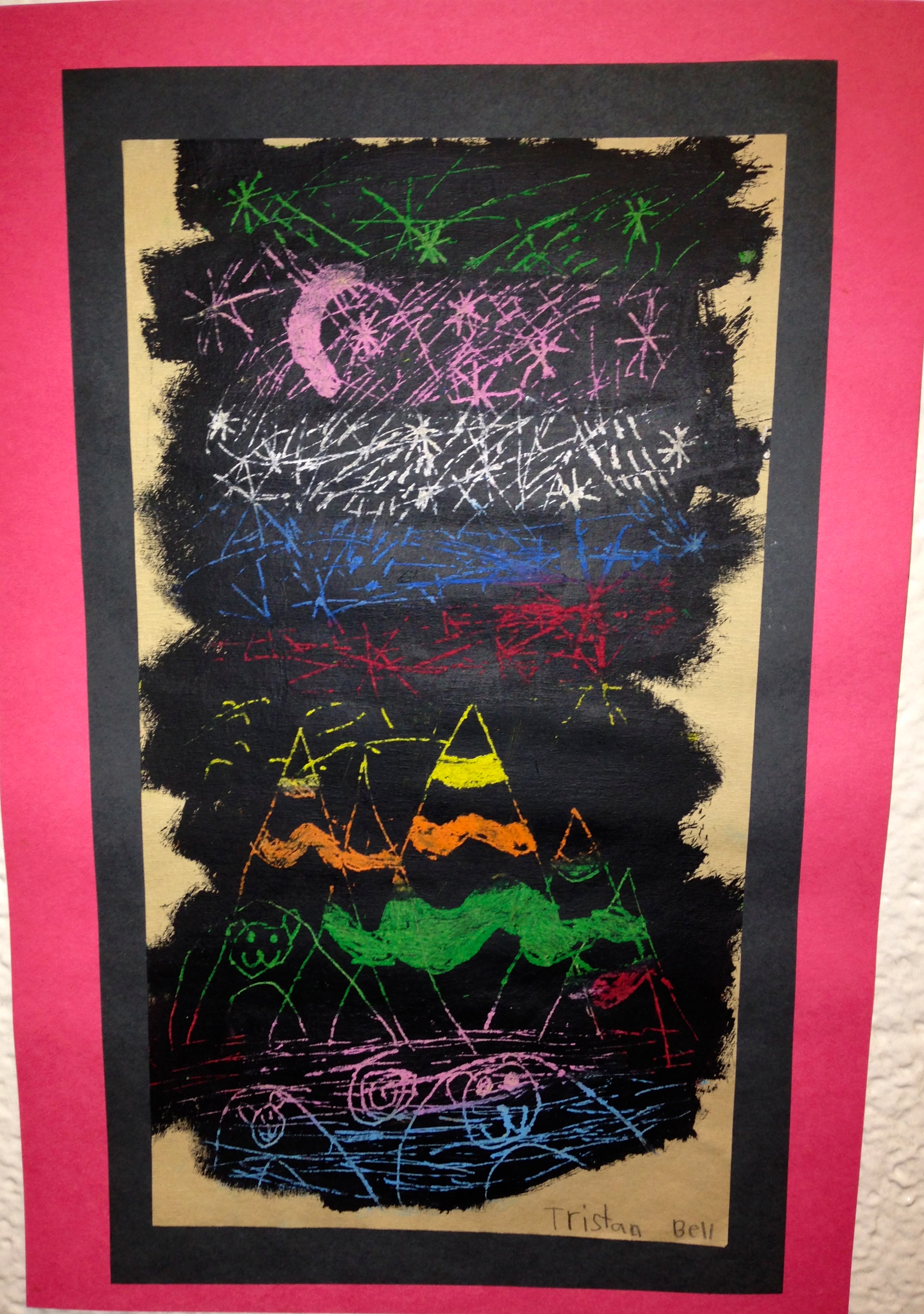
As soon as students finished painting over the the pastels they placed their papers on the drying rack. (This is not a one day project). In the remaining time students can start sketching on copy paper a rough copy of what they would like to draw. I have numerous drawing books available for them to look through and be inspired.

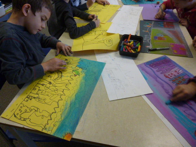
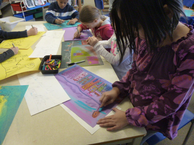
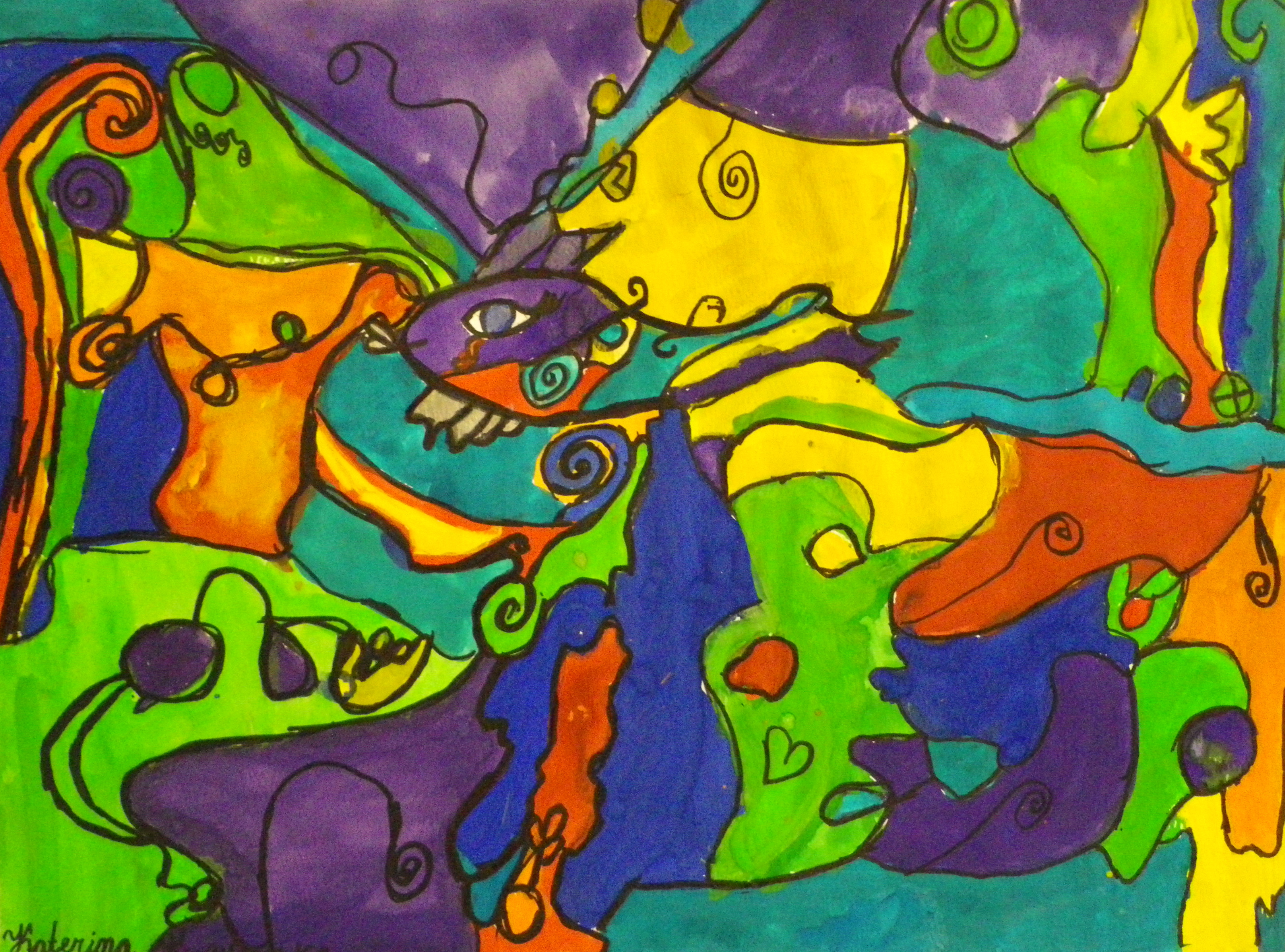
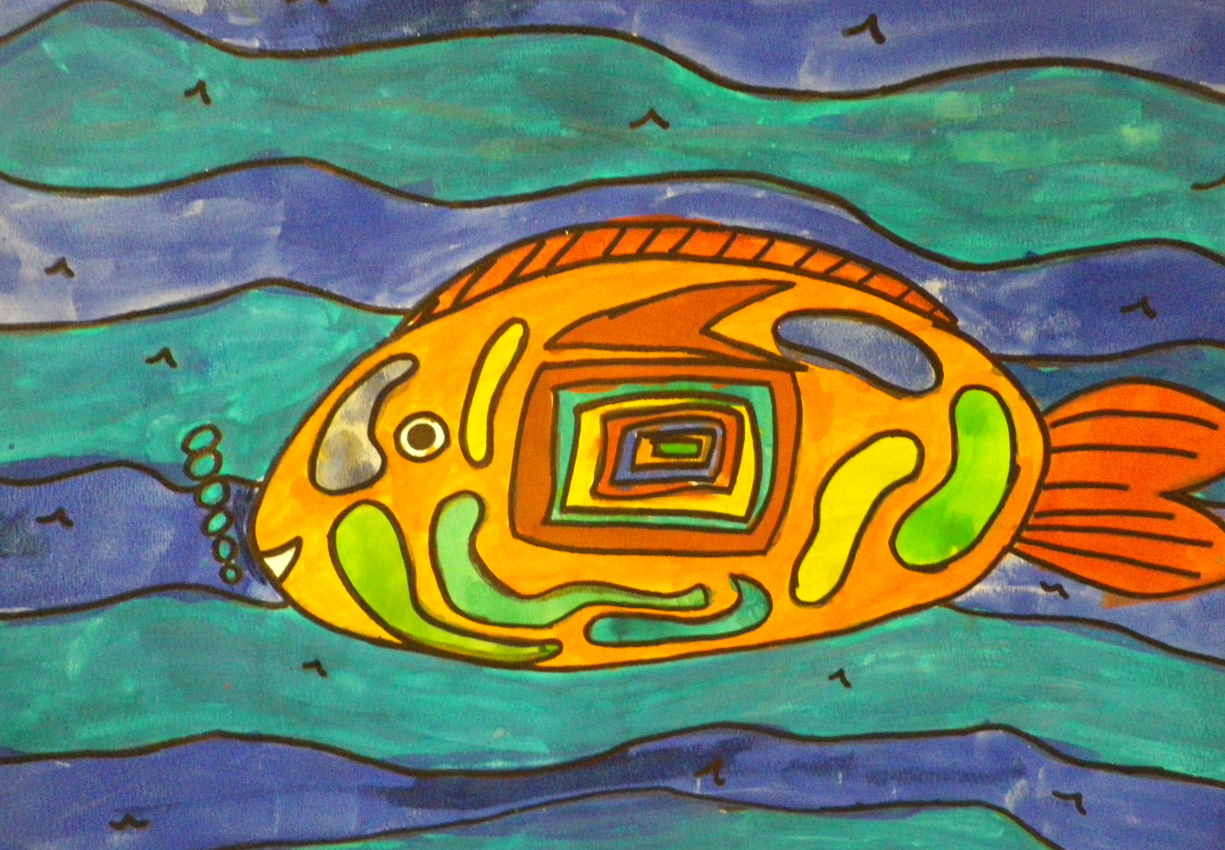
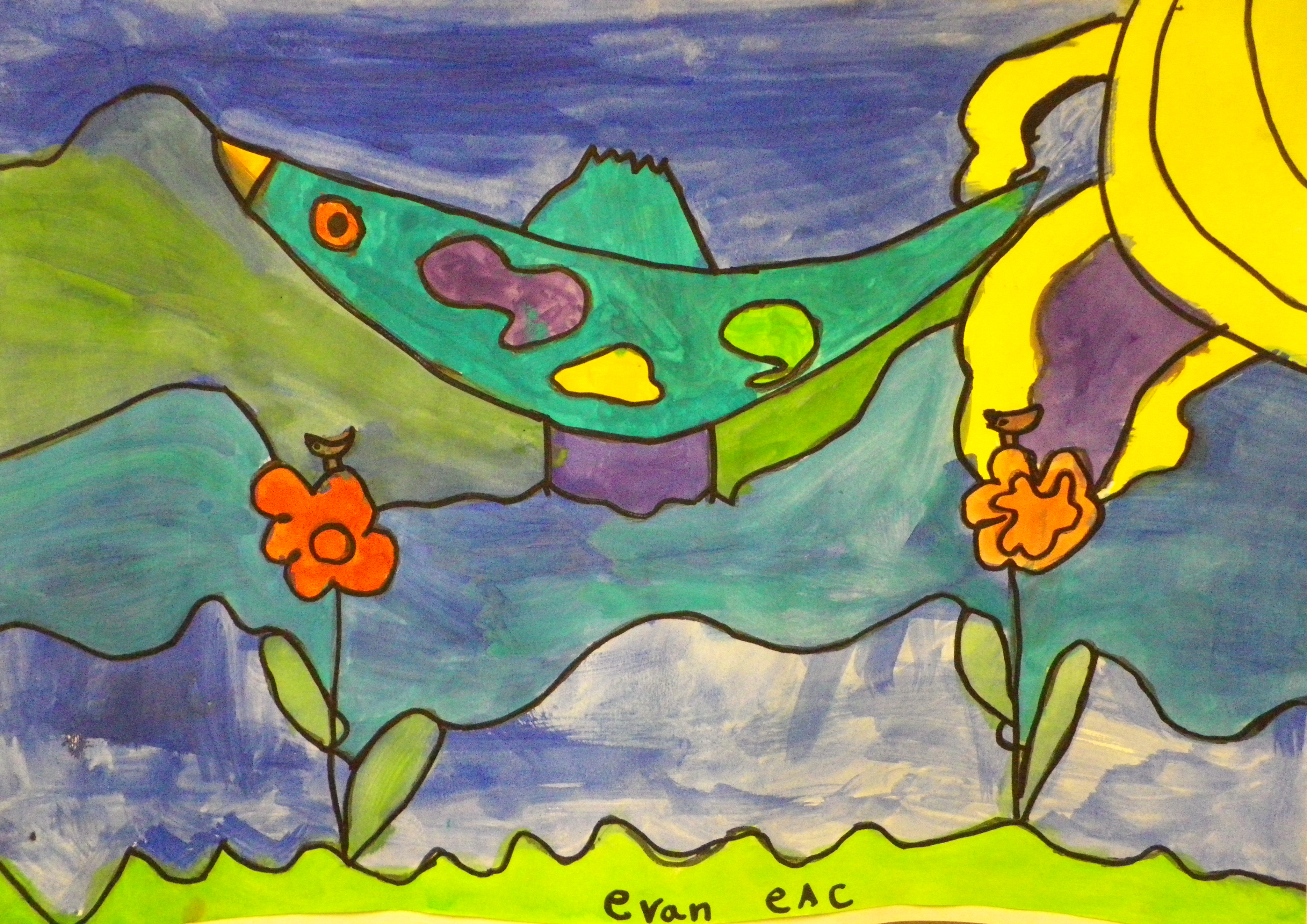
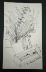
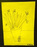
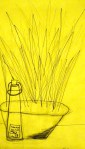
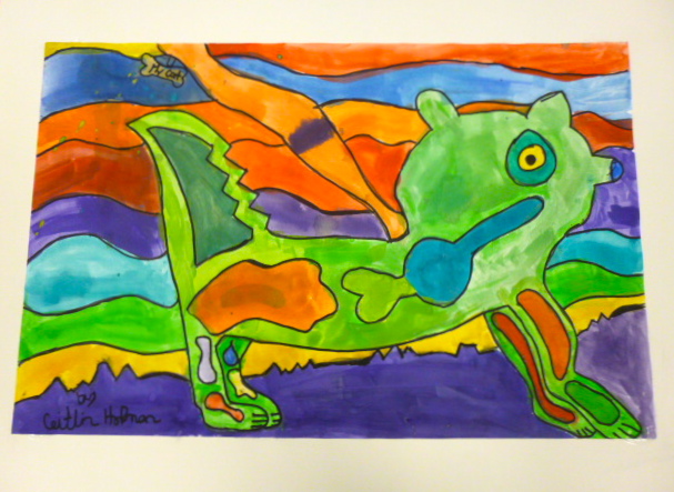
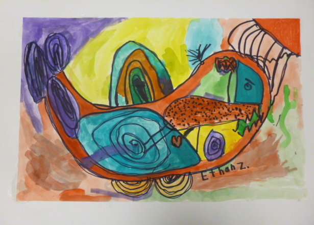
In the following class each student was given a paper clip that I bent open and that was their scratching tool. It works fairly well, especially if you hold it like a pencil and gently rub away the black paint. The assignment was to draw some animals but some of them chose to create a landscape or they did a combination of both. I mounted the finished pieces on two pieces of different coloured construction paper so that it looked like it was matted. Again I think that the grade 2/3 class did a great job.

IMG_0230IMG_0232 IMG_0233 IMG_0234 IMG_0235

Tissue Collage Landscape

….I introduced four different art projects this week

I had to think quickly this week as to what I was going to teach in art. I ordered some supplies before Christmas and they hadn’t come in yet so I scrambled to find a project(s) that required the materials I had on hand. Of all the projects that I assigned I think the one I introduced to my grade 3 class is my favourite so far.

We talked about landscapes and reviewed the components: foreground, background and horizon line. I demonstrated how to tear the tissue and overlap the colours to give the picture more depth. I then explained that once the tissue layer was complete we were going to cut out shapes from construction paper, magazines and art papers that we had created last year to create a foreground of flowers.

In the first class most of the students only finished gluing down the tissue paper. In the next class they will cut out their shapes from different materials, glue them into place and then using a fine tip black marker they will add detail to their cut outs and add some line drawings behind their collaged flowers.

I had lots of art books and posters to demonstrate the technique and show a variety of flowers that they could draw. I didn’t want everyone to gravitate to the blue tissue for their sky so I read them Peter Reynolds new book Sky Colour. It’s a wonderful book that every teacher who teaches art should have in their library.  
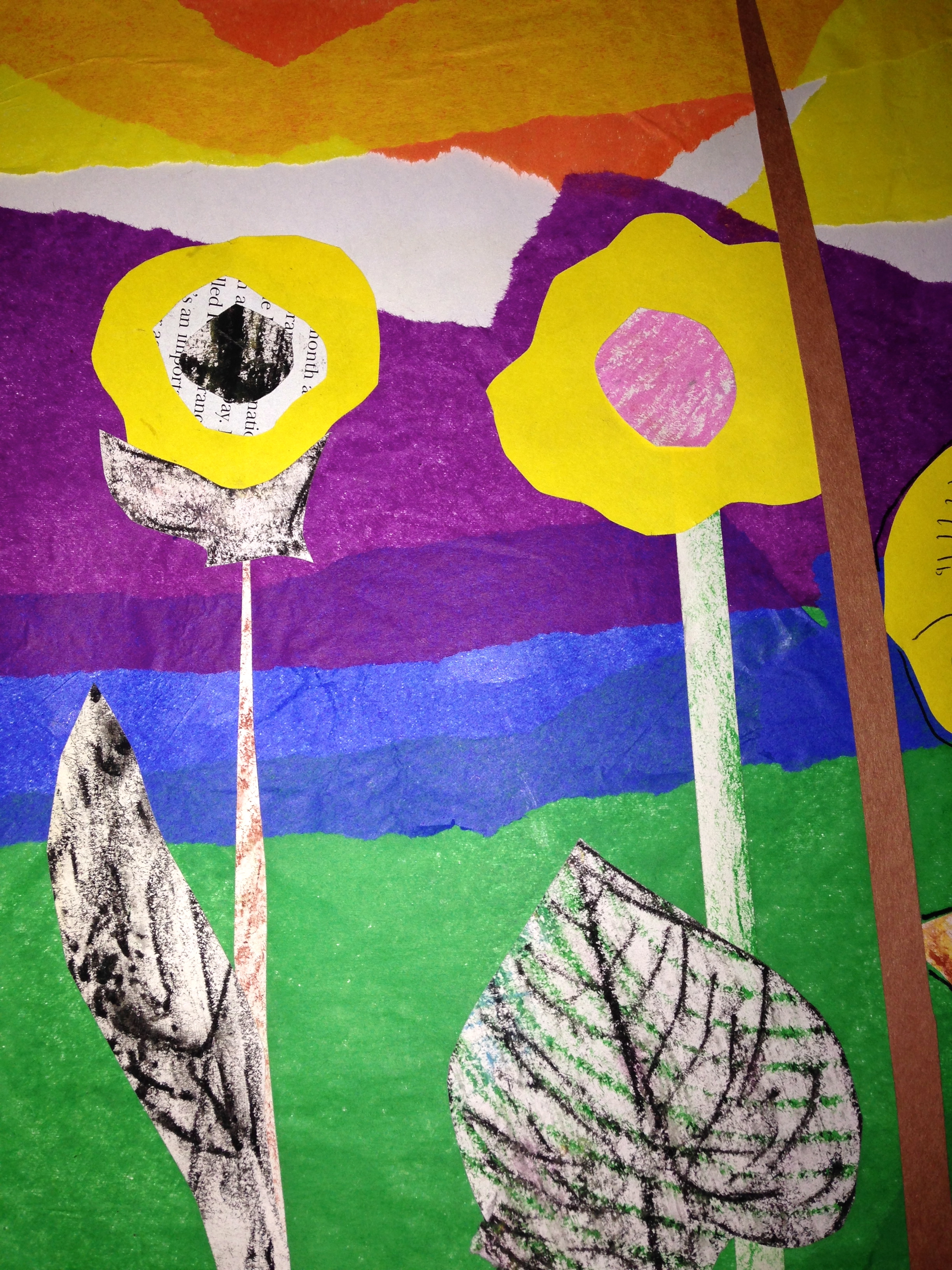
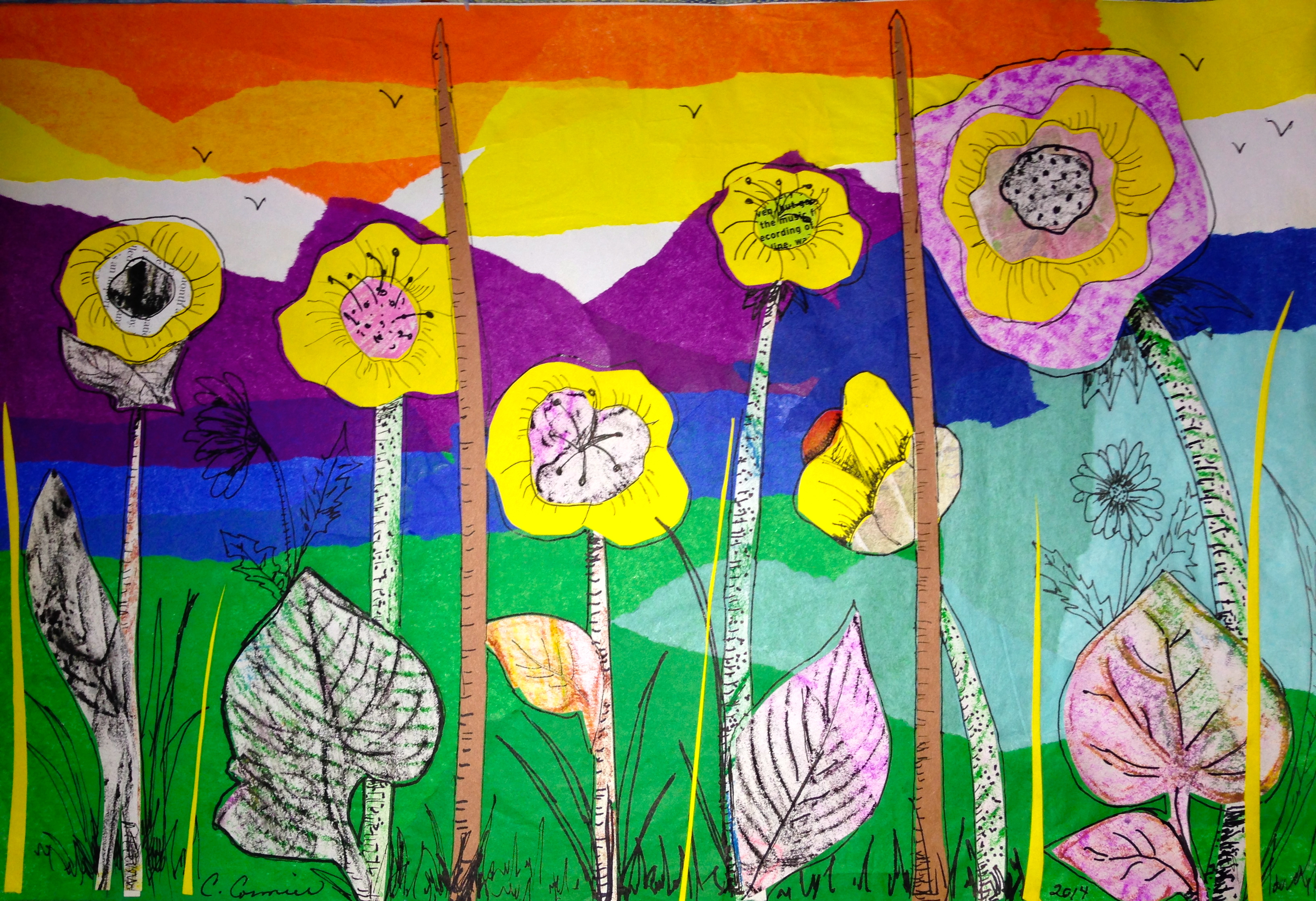
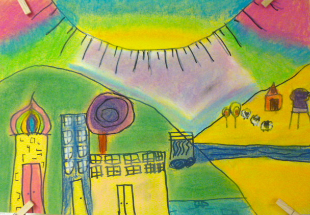
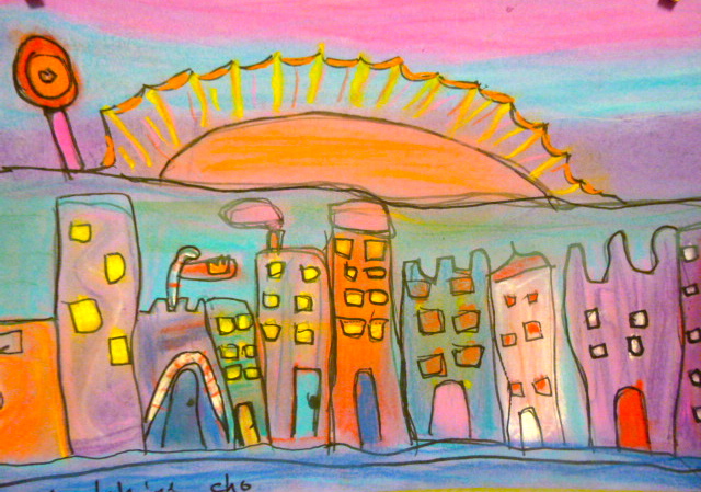
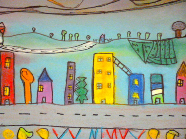
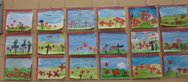
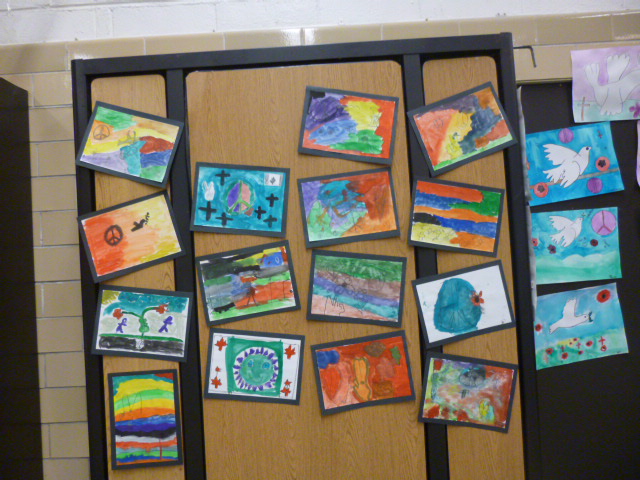
All my classes loved the book and took the message to heart. Very few chose a solid blue for their sky colour.

I started a sample with the children as they worked so that they could visualize what I had in mind. I think that the process is more important than the product and I find giving them a sample to look at helps them better understand the process. No two pictures are ever the same.

Today I finished my sample at home. The first picture shows the tissue in the background and the simple cut outs that are glued on top. In the second picture you can see a close-up of the detail that I drew in after with a fine tip black Sharpie and the third picture is the entire finished piece.

IMG_0221 IMG_0222

IMG_0224


I’m looking forward to seeing what my grade 3s come up with.

Cheers!


Daily Prompt: Colour

Write about anything you’d like, but make sure that all seven colors of the rainbow — red, orange, yellow, green, blue, indigo, violet — make an appearance in the post, either through word or image.

What better than colour wheels produced by grade 5 students to show all the colours, an art project done by a grade 3 student of multi-coloured concentric circles and a trip to the local fruit market where flowers and vegetables vibrate with colours of the rainbow.

P1030672 P1030668 P1030258 P1000969 IMGP0006


http://dailypost.wordpress.com/2014/01/07/daily-prompt-colors/

Simple Christmas Cards and Tags

….using fabric crayons and cotton swatches

During the last week of school before the Christmas holidays I needed a quick and easy project for the boys and girls to work on when they finished their art projects. For years I had fabric crayons sitting in my cupboard with no plans on how to use them. Last year I experimented with them and loved how they worked.

I gave each child a piece of photocopy paper and instructed them to fold it into four rectangles. On each rectangle the students had free reign to create any design they wanted. Many chose Christmas symbols, winter scenes or their names (the mirror image). The only thing they needed to do was fill in their design with lots of fabric crayon and sometimes they could get two or three prints from the same picture. They loved it when I ironed their designs onto a piece of cotton fabric. It was like magic.

ImageImageImage

Our Urban Rural Drawings

….in the Hundertwasser style

This week the grade 3 students have been working on their urban rural landscapes using vibrant chalk pastels.

We started the lesson discussing the components of a landscape; foreground, middle ground, background and horizon line. We talked about how objects in the foreground were larger and smaller in the background. I then showed the class images of Hundertwasser’s whimsical houses and lollipop trees.

The assignment was to draw city buildings in the foreground and a rural setting in the background. After drawing their rough copies, each student was allowed to choose a sheet of coloured construction paper and then redraw their landscape lines using first pencil and then black or silver marker.P1030784 P1030787

Starting at the top of their paper they then started to add colour using chalk pastels. I showed them how to blend colours using their fingers and pieces of tissue paper. Once all the colour was in place, the black lines were redrawn as the last step. P1030786P1030783 P1030782 P1030781 P1030780  The final results have been stunning. You be the judge. Enjoy!

P1030779

P1030778 P1030777 P1030790 P1030789 P1030788

More Morrisseau Paintings

….with shades of Ted Harrison

As my grade 3s completed their x-ray painting in the Morrisseau style it became clear that Ted Harrison’s style influenced many of them as well. Both artists were Canadians. Morrisseau was born in Northern Ontario and Harrison was born in England but later moved to Canada.

Morrisseau’s Spirit Bear

Inside Passage

Here are a few more finished x-ray paintings done by some of my grade 3 and grade 4 students.

IMGP0008 IMGP0009 IMGP0010 IMGP0015 IMGP0016

“Are you going to put our art on your blog, Mrs. Cormier?”

….I knew that some of my students knew about my blog but it still surprised me to hear this question

I needed a break from using paint. Most of the older students are pretty good at cleaning at the end of art class but some of the younger children, especially the boys, have a hard time with the cleaning concept. Two days ago I snapped and told my students that we were done with paint for awhile. When we go back I think I may limit the number of students who paint and have the rest of the students work with another medium. In other words, I’ll have two separate projects on the go.

Yesterday I introduced line drawing using pencil and then finishing if off with a fine tip Sharpie. I place a number of objects on their tables to arrange into an interesting still life.

I demonstrated how to draw what they see without lifting the pencil off the paper. We used rough copy paper to practise and then when they felt comfortable the students produced a final copy that was trimmed and then mounted on black construction paper. The following examples were done by grade 3s.

IMGP0001

So what’s next? Maybe I’ll use oil or chalk pastels. At least there won’t be any brushes to clean.

Cheers!

Art for Remembrance Day

….Picasso’s Doves of Peace drawings were the inspiration for this lesson

Pablo Picasso was very political and didn’t like how the world’s peace initiatives were emerging after after the the second world war. He created The Dove of Peace as an extraordinarily powerful and lasting political symbol for peace, liberation and equality around the globe. Doves also had a highly personal significance for Picasso, going back to childhood memories of his father painting the doves that were kept in the family home. Doves were a frequent presence in Picasso’s homes and studios in Paris and in the south of France. ( adapted from Tate.org.uk)

Back in the spring when I came across The Dove of Peace I decided then and there that I wanted to do a similar theme for this year’s Remembrance Day assembly. I liked the simplicity of the drawings and felt that my students would be up for the challenge.

I didn’t want every student to draw doves so I had them research symbols of peace that could be easily drawn. My only rule was that the picture couldn’t have blood or weapons in it. After working out a rough copy of what they wanted to draw I gave each student a piece of watercolour paper. They were allowed to choose between a small and medium size.

First they drew their symbol with pencil and then went over the lines with crayon. To make the symbol  stand out more I showed them how to add a bit of black marker. Then I taught them how to do a simple wash of colour for the their background while leaving the symbol white. This was a difficult concept for some because they wanted to paint everything.

P1030525 P1030528

As a final touch the children were allowed to take photographs of each other. The photo had to symbolize friendship and or peace. Some children embraced each other while others shook hands. If they didn’t want a photo taken the other option was to find a magazine picture with the same theme. The pictures were in black and white because we printed them from the computers in the room onto our shared printer which only prints in black.

On Friday, most of the art was finished and ready to be displayed in the gym. Other classes did a similar theme and some of the younger grades changed it up a bit. All in all, everyone did a great job and the space looks wonderful. A big thank you goes out to all the staff and students.

P1030690

P1030691

P1030693P1030694P1030695

Hung Over 120 Pieces of Children’s Art This Week

…..90 of them were put up yesterday

I teach about 110 students art and I feel it’s important that every child’s work should be displayed. This week I knew it was time to take down some of the older work and replace it with newer assignments.

In grade 5, I taught the students about the colour wheel. Even though I’ve taught art as a prep coverage subject for only the last two years, when I had a grade 5 homeroom I always did my own art. So for the last 14 years, the colour wheel was always been an important aspect of my art program. This year I decided to change it up a bit and instead of giving them a prepared wheel that they added colour to, I had the students create their own wheels and I encouraged them to be somewhat creative while remaining true to the colours and placement of the colours.

Once the acrylic paint dried I had the students take it one step further and add a splash of Zentangle designs to their wheels. Zentangle is an art form using structured repetitive patterns to create beautiful images. It’s like doodling but more carefully applied. Here are a few examples of their amazing work:

P1030668 P1030669 P1030670 P1030672The other 90 pieces that I hung yesterday were inspired by Picasso’s Peace Art. Here’s a sneak preview.

P1030659 P1030661

I’ll post the lesson in the next day or so. Have a great weekend!

Grade Three’s X-ray Paintings

…. using Norval Morrisseau’s painting style

Norval Morrisseau was a First Nations artist from Canada. He is often referred to as the Picasso of the North and his style is characterized by thick black outlines and bright colours. He developed his own techniques and artistic vocabulary which captured ancient legends and images that came to him in visions or dreams. The lines in his paintings represent energy and often connect one symbol or body part to another. The x-ray technique allows the observer to see the energy within the person or animal.

After discussing Morrisseau’s style the boys and girls were directed to draw something that was important to them. The beauty of this activity is that drawings should be simple, and don’t even need to look like the animals that they represent. The students learned how to apply bright watercolours to their paper after they outlined their line drawing with black markers. Once they finished painting they went over the black lines again.

I love each and every one of them. Here are the first 8 pictures that were completed today:

Image

ImageImage


P1030431 P1030430 P1030436 P1030435 P1030434