….thanks to Cee for hosting CFFC
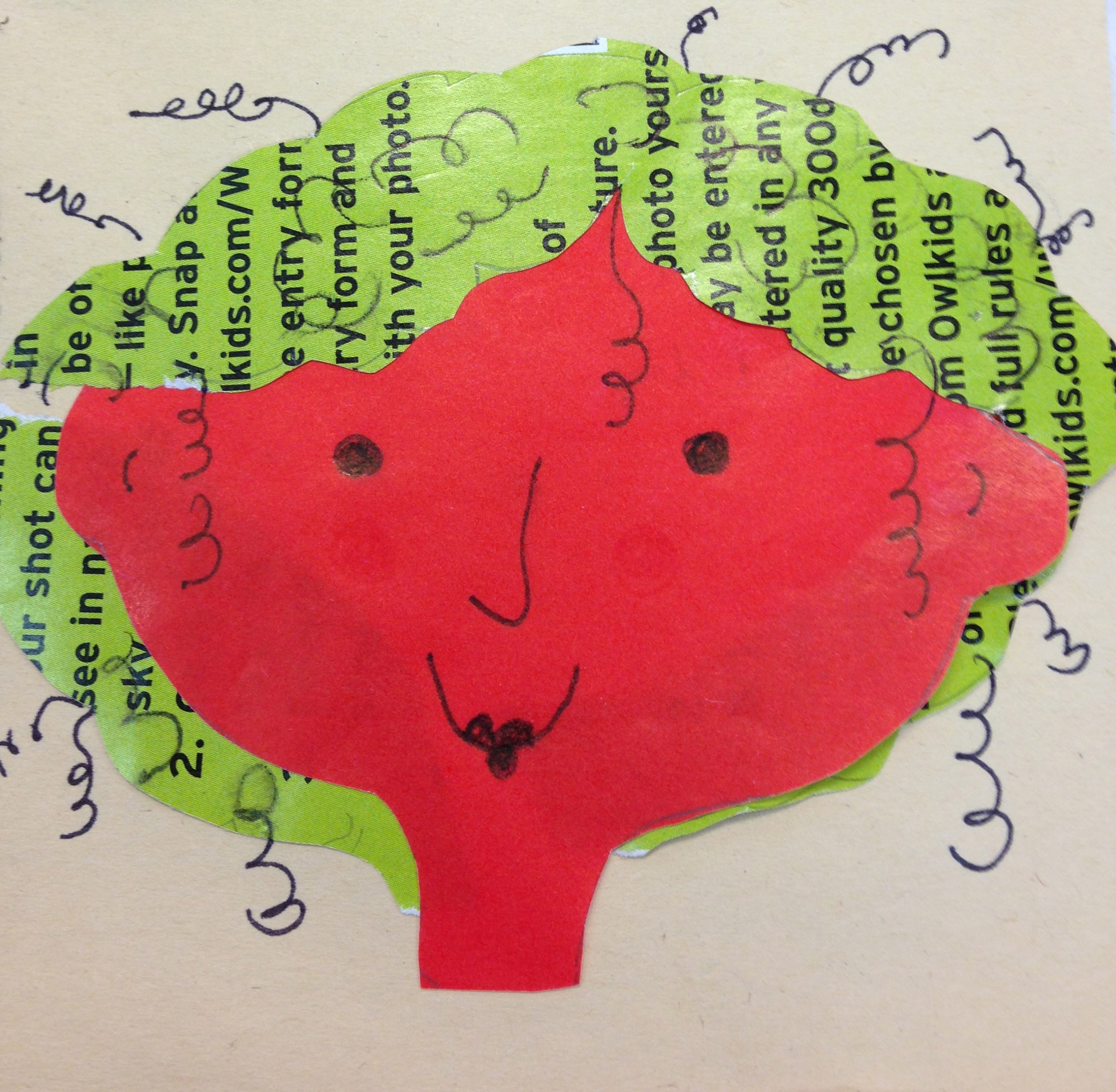
Nothing says Christmas like red and green.


….pinks and purples seem to be the new modern festive colours


….thanks to Cee for hosting CFFC
Nothing says Christmas like red and green.
….pinks and purples seem to be the new modern festive colours
….thanks to Nancy Merrill for hosting A Photo a Week Challenge
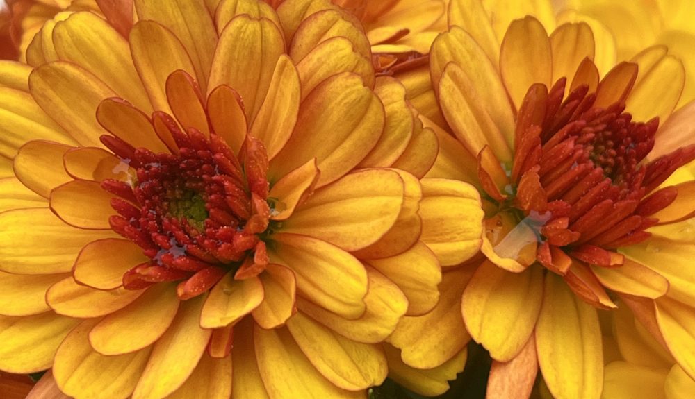
Contrasting colours or complementary colours are opposite each other on the colour wheel. They are often used in costumes and uniforms because together the colours really stand out. The following are examples of complementary colours: purple and yellow, red and green and orange and blue.


….a challenge from Sue Llewellyn
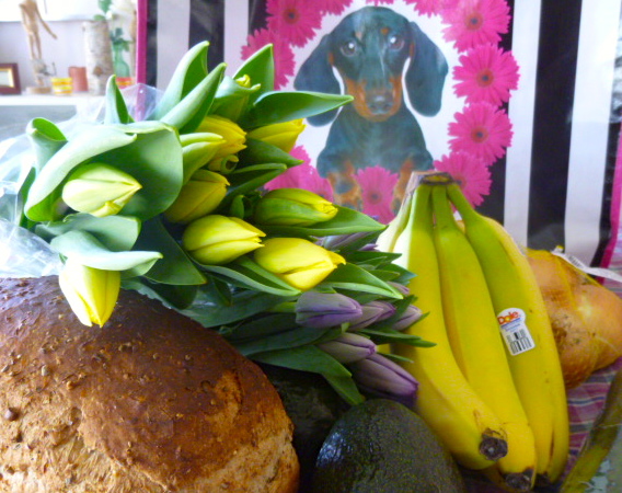


To me contrast is not just complementary colours, side by side, but anything that makes something else stand out. Black and white and neutral colours make bright colours stand out and unusual groupings provide contrast. I love the dachshund surrounded by the bright pink flowers over the black and white stripes.
For more photographs that feature contrast go to A Word a Week Photograph Challenge.
