A Photo a Week Challenge – Contrasting Colours

….thanks to Nancy Merrill for hosting A Photo a Week Challenge

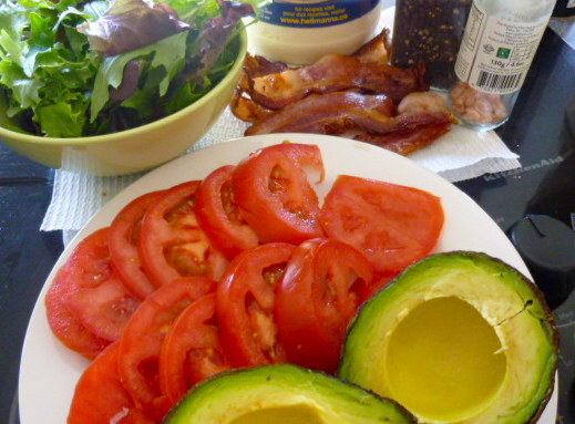
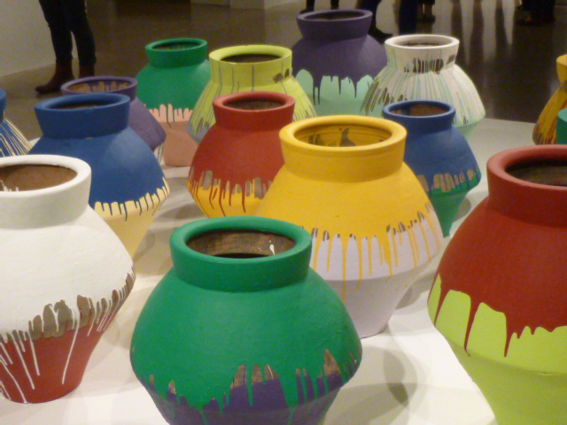
Contrasting colours or complementary colours are opposite each other on the colour wheel. They are often used in costumes and uniforms because together the colours really stand out. The following are examples of complementary colours: purple and yellow, red and green and orange and blue.

fullsizeoutput-fa
fullsizeoutput-eb
IMG-1490
fullsizeoutput-6f44
IMG-2645
P1060244
IMG-3016
54fa756d-516d-4bc3-85b0-595eb3638717
IMG-3869
IMG-6554
IMG-0030
IMG-0037

A Word A Week Photograph Challenge – Contrast

….a challenge from Sue Llewellyn

ImageImageImageImageImageImageImage

To me contrast is not just complementary colours, side by side, but anything that makes something else stand out. Black and white and neutral colours make bright colours stand out and unusual groupings provide contrast. I love the dachshund surrounded by the bright pink flowers over the black and white stripes.

For more photographs that feature contrast go to A Word a Week Photograph Challenge.